
Personalized LED signs have become a staple of modern interior design, transforming blank walls into vibrant, expressive focal points. Whether you are looking to display an inspiring quote, a family name, or a business logo, selecting the perfect combination of typography and illumination is key to achieving a polished look. The best font styles and colors for a personalized LED letter sign depend heavily on the room’s function, desired ambiance, and the physical limitations of the LED flex tubing. Generally, clean sans-serif or block fonts paired with warm white or soft pastel colors offer the highest readability and most versatile aesthetic, while flowing cursive scripts in vibrant neon pink or blue create intimate, moody focal points.
Whether you are designing a cozy bedroom nook or upgrading a modern living room, choosing a custom letter with led light sign requires balancing visual style with technical limitations. A sign that looks stunning on a computer screen during the design phase might become a blurry, unreadable glare once illuminated on your wall if the font is too intricate or the color is too intense. By understanding how light behaves in different spaces and how physical LED tubing is bent and assembled, you can create a custom piece that elevates your home’s ambient lighting while remaining perfectly legible and safe.
Choosing the Right Font Style for Your Letter with LED Light Sign
When customizing a letter with led light sign, typography is the foundation of your design. Unlike traditional printed text, illuminated signs rely on physical LED flex tubing—typically made of flexible silicone or PVC—which is bent by hand and mounted onto a backing material. This physical medium introduces specific structural constraints that directly affect how different font styles perform when lit.
Products mentioned in this guide
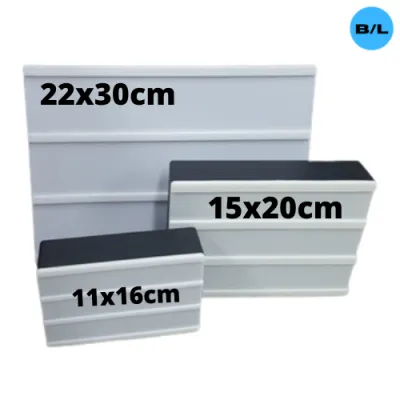
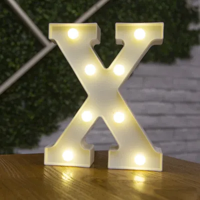
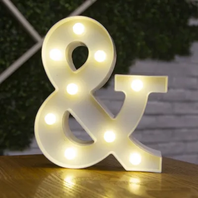
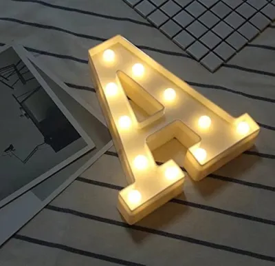
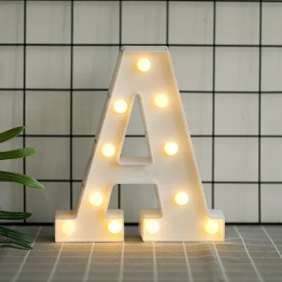
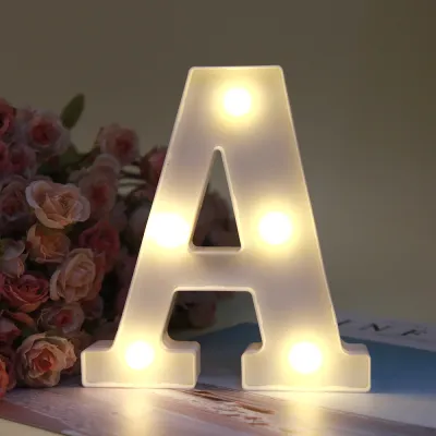
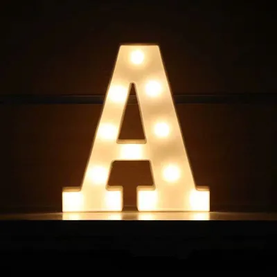
Prices are valid at publication and may change. Please refer to the product page for the latest price.
Script and Cursive Fonts
Script and cursive fonts offer an elegant, romantic, and highly personalized appeal. They are exceptionally well-suited for intimate spaces such as bedrooms, vanity areas, walk-in closets, or wedding backdrops. The flowing, continuous lines of cursive mimic traditional hand-bent glass neon, giving the sign a classic, artistic quality. However, cursive fonts come with a major physical limitation: overly intricate loops, tight swirls, or complex uppercase letters can lose clarity when illuminated. Because standard LED flex tubing has a physical thickness of 6mm to 8mm, bending the tube into extremely tight radiuses can cause the material to crimp, which restricts heat dissipation and can create dark spots. Additionally, if the loops of a cursive letter are too tight, the light from adjacent segments will bleed together, turning a letter like “e” or “o” into an illegible bright blob.
Block and Sans-Serif Fonts
If readability and modern styling are your primary goals, block and sans-serif fonts are the ideal choice. These fonts feature clean, straight lines, sharp angles, and uniform stroke widths, making them highly readable from a distance. They are perfect for minimalist condos, home offices, gaming setups, or home gyms. From a manufacturing standpoint, block fonts are highly reliable because the LED tubing can be cut and joined at precise angles without forcing extreme bends in a single continuous piece. This ensures a highly uniform light output across the entire sign. Furthermore, the bold geometry of sans-serif lettering complements contemporary architectural lines, integrating seamlessly with modern furniture and clean interior themes.
Handwritten and Quirky Fonts
For spaces that require a more relaxed, playful, or creative vibe, handwritten and quirky fonts are an excellent alternative. These styles feature organic, slightly imperfect lines that give the sign a friendly, casual character. They are particularly popular in children’s playrooms, creative studios, home bars, or informal lounge areas. Because these fonts often have rounded edges and generous spacing, they are relatively easy to manufacture using LED flex tubing. They help break up the rigid lines of standard room layouts, adding a touch of whimsy and warmth to the space.
The Crucial Readability Rule
Regardless of the font style you prefer, there is a fundamental rule of legibility to keep in mind: always avoid extremely thin, heavily distressed, or double-lined fonts. The physical diameter of the LED flex tube requires adequate physical spacing between lines and individual letters. If letters are placed too close together, the intense light bleed—known as the halo effect—will blur the edges of the characters, making the sign difficult to read, especially in a dark room. As a general guideline, maintain a minimum gap of at least 1.5 to 2 centimeters between individual letters and ensure that the overall height of the letters is proportional to the thickness of the LED tube. For small signs under 50 centimeters in width, stick to simple, open fonts to preserve legibility.
Best LED Colors for Different Ambient Effects
The color of your custom LED sign does more than just light up a room; it actively shapes the mood, influences perceived space, and dictates how comfortable the environment is over extended periods. Different colors emit light at varying wavelengths, which interact uniquely with your eyes and your home’s interior surfaces.

Warm White (2700K to 3000K)
Warm white is the most versatile, cozy, and inviting color option available. Emitting a soft, golden glow that closely mimics traditional incandescent lighting, warm white is highly recommended for living rooms, bedrooms, and dining areas. It is the safest choice for spaces where relaxation is the priority, as it does not emit the harsh blue light wavelengths that can disrupt sleep patterns or cause eye strain. In tropical homes, warm white light beautifully complements natural materials such as local hardwood furniture, rattan accents, capiz shell decor, and warm neutral paint colors, creating a rich, welcoming atmosphere.
Cool White (4000K to 5000K)
Cool white provides a crisp, bright, and highly modern aesthetic. With its clean, high-contrast light output, cool white is ideal for task-oriented spaces such as home offices, modern kitchens, or retail-style display shelves. It makes letters appear exceptionally sharp and distinct, ensuring maximum readability even in well-lit rooms. However, because cool white has a higher concentration of blue light, it can feel clinical or sterile if used as the primary light source in a bedroom or living room late at night. It is best paired with minimalist, monochromatic, or industrial interior designs.
Single Neon Colors (Pink, Blue, Green, Yellow, and Red)
For those looking to make a bold design statement, single-color neon options offer a vibrant and moody impact. Soft pink and purple are incredibly popular for creating a chic, retro-glam aesthetic in vanity areas or bedrooms. Deep blue and emerald green evoke a cool, late-night lounge or cyberpunk vibe, making them perfect for home theaters, gaming rooms, or bar areas. When choosing a highly saturated color, keep in mind that it will cast a strong, tinted shadow on surrounding walls and furniture. A vibrant red or deep blue sign can completely alter the color appearance of your room’s decor, which is a key trade-off to consider before finalizing your order.
RGB and Color-Changing Options
If you cannot commit to a single color, RGB and color-changing LED signs offer the ultimate flexibility. These systems allow you to cycle through a full spectrum of colors, adjust brightness levels, and even set dynamic flashing or fading patterns using a remote control or a smartphone application. This makes them incredibly fun for entertainment zones, gaming setups, or holiday decorations. However, RGB signs come with a few notable warnings. They require a compatible, high-quality controller, which adds another point of potential electronic failure. Additionally, rapidly cycling colors or flashing lights can quickly cause visual fatigue and headache, making them unsuitable for relaxing, low-stress home environments. If you choose an RGB sign, look for one that allows you to lock in solid, static colors for daily use.
Top Font and Color Combinations for Your Home
To help you visualize how these design principles translate into real-world spaces, we have curated a list of highly successful font and color pairings tailored to specific rooms and aesthetics.
The Romantic Bedroom
For an intimate, restful bedroom retreat, pair a delicate, flowing script font with Warm White or Soft Pink LEDs. This combination produces a gentle, low-glare illumination that mimics a soft candlelit glow. It functions beautifully as a decorative nightlight or secondary accent lighting, softening the sharp angles of bedroom furniture and creating a soothing environment that promotes relaxation.
The Modern Condo Living Area
To elevate a contemporary condominium living room, choose a clean, medium-weight block or sans-serif font paired with Warm White or Cool White. This combination mimics high-end architectural signage found in boutique hotels and luxury galleries. It coordinates effortlessly with neutral color palettes, concrete finishes, and glass elements, providing a sophisticated focal point that enhances the room’s perceived value without clashing with your existing decor.
The Gamer or Creator Studio
If you are designing a space for gaming, streaming, or creative work, pair a bold, wide sans-serif font with Neon Blue, Purple, or dynamic RGB lighting. This combination builds an energetic, immersive, and retro-futuristic atmosphere. The saturated colors look exceptionally striking on camera, providing an eye-catching backdrop for video creators while enhancing the contrast of computer monitors and TV screens in a darkened room.
The Kids' Playroom
For a lively and cheerful children’s space, opt for a rounded, friendly handwritten font paired with Bright Yellow or a multi-color layout (where different words or letters use different solid colors). This bright, high-energy pairing stimulates creativity and play, making the room feel incredibly welcoming and fun.
To easily compare these design options, refer to the summary table below:
| Room Type | Recommended Font | Best LED Color | Primary Vibe/Effect |
|---|---|---|---|
| Romantic Bedroom | Delicate Script / Cursive | Warm White or Soft Pink | Soft, intimate, and relaxing glow |
| Modern Condo Living Area | Minimalist Block / Sans-Serif | Warm White or Cool White | Clean, architectural, and premium |
| Gamer / Creator Studio | Bold Sans-Serif | Neon Blue, Purple, or RGB | Energetic, immersive, and cyberpunk |
| Kids' Playroom | Rounded Handwritten | Bright Yellow or Multi-Color | Cheerful, stimulating, and playful |
Crucial Specs and Safety Checks Before Ordering
Before you click buy on an online marketplace or place a custom order with a local lighting shop, it is vital to review the technical specifications of your sign. Because LED signs are active electrical appliances, overlooking these details can result in compatibility issues, poor performance, or safety hazards.
Voltage and Power Adapters
In the Philippines, the standard electrical utility grid operates at a voltage of 220V with a frequency of 60Hz. Many pre-made LED signs imported from overseas are packaged with power adapters designed for 110V systems or standard 50Hz grids. Before plugging in your sign, check the label on the power adapter (the “brick”) to ensure it explicitly states an input compatibility of “100V-240V ~ 50/60Hz.” Using an incompatible or uncertified power supply can cause the adapter to overheat rapidly, melt, or trigger an electrical short circuit, posing a serious fire hazard. Always look for basic electrical safety marks, such as CE, RoHS, or local PS/ICC certifications, printed clearly on the power supply casing.
Material and Backing
Most modern LED letter signs feature flexible silicone tubes mounted on a transparent acrylic backing sheet. High-quality acrylic is sturdy, lightweight, and virtually invisible when the sign is turned on, allowing the letters to appear as if they are floating on your wall. For a more industrial or rustic aesthetic, some manufacturers offer metal grids or painted wooden backplates. In the tropical and highly humid climate of the Philippines, moisture resistance is a critical factor. High humidity levels, especially in condos near coastal areas or in rooms without continuous air conditioning, can degrade low-quality adhesives over time. This causes the flexible LED silicone tubing to sag, peel away from the acrylic backing, or trap moisture in the electrical solder joints. Ensure your vendor uses high-grade, moisture-resistant acrylic and industrial-strength adhesives.
Dimming and Controls
An illuminated LED sign can be surprisingly intense, particularly in smaller rooms or during late-night hours. For this reason, we strongly recommend choosing a sign that includes a built-in inline dimmer, a wireless remote control, or smart home app integration. Fixed-brightness LED signs are often far too bright for comfortable ambient viewing, causing uncomfortable glare and eye strain. A dimmer allows you to dial down the brightness to a comfortable 10% to 20% for a relaxing nightlight effect, or boost it to 100% when you want to showcase the sign during a gathering.
Installation and Safety Boundaries
Most residential LED signs are lightweight and designed as plug-and-play units that hang from simple wall hooks or chains. However, if your design involves fixed wiring (hardwiring the sign directly into your home’s electrical switches), mounting the sign on high ceilings, or installing it in damp environments—such as a semi-outdoor balcony, a covered patio, or near a bathroom vanity—safety must be your top priority. Before beginning any installation, isolate the power source by turning off the corresponding circuit breaker. For any complex mounting, suspended loads, or hardwired electrical connections, always hire a qualified professional electrician. Never attempt to modify the internal wiring of an LED sign yourself, as doing so will void the manufacturer’s warranty and increase the risk of electrical shock.
Frequently Asked Questions (FAQ)
How long do custom LED letter signs typically last?
High-quality LED flex tubes are highly durable and are generally rated to last between 30,000 and 50,000 hours of continuous operation. In practical terms, if you run your sign for six hours every day, it can easily last for over fifteen years. However, the actual lifespan of your sign is heavily dependent on heat dissipation, environmental conditions, and the quality of the external power adapter. Because the Philippines experiences high ambient temperatures year-round, heat is the primary enemy of LED longevity. To maximize your sign’s lifespan, avoid mounting it in unventilated corners, keep it away from heat-generating appliances, and always turn the sign off when you leave the room or go to sleep.
Can I use a custom LED sign outdoors in a tropical climate?
Most standard custom LED letter signs sold on online marketplaces are designed strictly for indoor use and do not possess any weatherproofing. Exposing an indoor-rated sign to high humidity, heavy tropical downpours, or direct sunlight will rapidly damage the unit. Rainwater will penetrate the silicone tubing and short-circuit the LEDs, while intense UV rays will cause the clear acrylic backing to turn yellow and brittle, and degrade the adhesive. If you intend to use a sign on an outdoor patio, balcony, or storefront, you must explicitly order a sign with an IP65 or higher weather-resistant rating. Outdoor signs feature fully sealed silicone casings, waterproof electrical connectors, and outdoor-rated power supplies designed to withstand wet and humid conditions.
Does the LED color affect the perceived brightness of the sign?
Yes, the color of the LED has a significant impact on how bright the sign appears to the human eye, even if the actual electrical power consumption is identical across different colors. Human eyes are naturally more sensitive to green, yellow, and white light wavelengths. Consequently, warm white and cool white signs will always appear much brighter and will cast a larger halo of ambient light onto surrounding walls than deeply saturated colors like royal blue, deep red, or dark purple. If you are installing a sign in a small bedroom and want to avoid excessive glare, opting for a saturated color like soft pink or deep blue will provide a much gentler, moodier glow, whereas a white or yellow sign will almost certainly require a dimmer to keep the light comfortable.
Community discussion
Share your experience or ask a question. Comments are reviewed before publication.