
Arranging picture frames on a wall without a clear plan often leads to a cluttered display and unnecessary wall damage. To achieve a balanced, professional look, you must treat your collection of frames as a single, cohesive visual unit rather than a series of isolated items. This balance is achieved by planning your layout on a flat surface first, selecting a structural style that matches your room’s aesthetic, maintaining consistent spacing between frames, and anchoring the entire arrangement to a central focal point. By following a systematic approach, you can transform a chaotic assortment of art and photos into an intentional, eye-catching gallery wall.
Plan Your Layout Before Hitting the Wall
Before picking up a hammer, gather all the elements of your display in one dedicated workspace. Collect every frame, art print, and photograph you intend to include in the arrangement. Laying these items out on a large table or directly on the floor gives you a physical, risk-free canvas where you can experiment with different compositions. You can easily swap pieces, adjust orientations from portrait to landscape, and see how different frame finishes interact next to one another.
Once you are satisfied with the arrangement on the floor, translate this physical layout into paper templates. Place each frame onto a sheet of kraft paper or newspaper, and trace its outer edges with a pencil. Cut out these paper shapes and label each one with the name of the corresponding artwork. These lightweight templates allow you to test your layout directly on the wall using painter’s tape, which protects your paint while letting you step back and evaluate the scale, height, and overall balance from across the room.
Products mentioned in this guide

214 Lazada user ratings
💰Price:Not bad but good enough 🎨Design:idk, im just doing this for coins 🛡️Safety:hi uwu ig idk 🔍Quality:el sigma sigma boy 😅👍
Multiple color options, Nice packaging, Nice packaging, Sturdy wooden frame, Classic design style,
they're perfect and I got them a day after I ordered 😊👏
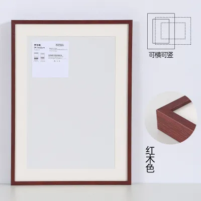
22 Lazada user ratings
The backboard is very solid. There is no odor. It even comes with the picture prints.
Installation is really convenient, it only took a few minutes to get it done.
The quality is excellent and everything arrived in perfect condition.
The item was warped and damaged when opened.
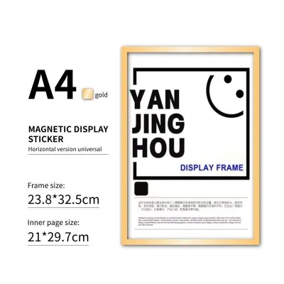
29 Lazada user ratings
price is good. the magnetic frame is surprisingly easy to use and it actually holds the photos in place within the frame because of the magn…Read full reviewShow less
price is good. the magnetic frame is surprisingly easy to use and it actually holds the photos in place within the frame because of the magnet. I will order again soon.
😍🥰😍🥰😍🥰😍🥰😍🥰😍🥰😍🥰😍🥰😍🥰not yet tried hopefully it will serves itsnpurpose.
salamat, Seller. useful talaga sya :)

22 Lazada user ratings
ok lang. mganda nmn. kaso akala ko nka frame hindi pala.
💰Price:cheaper 🎨Design:ok lng

Prices are valid at publication and may change. Please refer to the product page for the latest price.
Choose a Classic Gallery Wall Layout
The structural layout you choose defines the overall mood of your room and dictates how your eyes move across the wall. Selecting the right layout depends heavily on the types of frames you own and the architectural style of your living space.

The Grid Layout
The grid layout is highly structured and relies on perfect symmetry to create a clean, modern, and sophisticated appearance. This style works best when you have a collection of identical or highly similar frames, particularly those of the exact same size, color, and matting. It is an excellent choice for displaying a series of related black-and-white photographs or minimalist prints.
To execute a successful grid, you must align the top, bottom, and side edges of the frames with absolute precision. The spacing between each row and column must remain completely uniform, typically ranging from two to three inches. Because even a slight misalignment can disrupt the clean lines of a grid, using a level and a measuring tape is essential.
The Salon or Eclectic Layout
If you have a diverse collection of frames in various sizes, materials, and colors, the salon or eclectic layout offers a beautiful way to display them together. This style embraces variety but maintains visual balance by organizing the pieces around a central anchor. The anchor is typically your largest, most visually striking frame or artwork, which serves as the focal point of the entire display.
When building outward from your central anchor piece, you must balance the visual weight of the surrounding frames. Place larger, thicker, or darker frames closer to the center or near the bottom of the arrangement to ground the display. Lighter, smaller, or thinner frames should drift toward the outer edges and top sections to prevent a top-heavy appearance.
The Organic or Freeform Layout
An organic or freeform layout offers a relaxed, evolving arrangement that can grow over time as you collect new pieces. Unlike the rigid grid or the centralized salon style, a freeform layout does not rely on a strict outer boundary. Instead, it feels natural and spontaneous while still maintaining an underlying sense of order.
The secret to keeping a freeform layout from looking messy is to establish an invisible structure. You can achieve this by ensuring that every frame aligns along at least one edge or center line with a neighboring frame. Even if the outer edges of the entire gallery are irregular, these internal alignments create a visual thread that guides the eye smoothly.
Master the Spacing and Alignment Rules
The difference between a professional-looking gallery wall and a cluttered mess almost always comes down to spacing. When frames are hung too far apart, they lose their connection to one another and look like isolated objects floating on a blank wall. When they are placed too close together, they compete for attention and create visual noise. To avoid these issues, you must treat the entire collection of frames as if it were one single, large piece of art.
As a general rule, maintain a consistent gap of two to three inches between every frame in your arrangement. If you are working with very large frames, you can increase this gap to four inches; for smaller frames, a tight one-and-a-half-inch spacing works beautifully. To make this process easier and more accurate, cut a small piece of cardboard or wood to your desired spacing width to use as a physical spacer block as you hang each piece.
Alignment is another critical tool for creating visual flow across different frame sizes. Try to align the center lines of adjacent frames, or ensure that the top or bottom edges of neighboring pieces form a continuous horizontal line. These shared lines provide the human eye with a predictable path to follow, which instantly brings a sense of calm and intentionality to a highly varied collection.
Anchor Your Arrangement to a Focal Point
A gallery wall should never look like it is floating aimlessly in space; it needs to be anchored to the room’s existing architecture or furniture. Positioning your arrangement above a major piece of furniture, such as a sofa, a bed, a console table, or a sideboard, grounds the display and integrates it into the overall room design.
To ensure the arrangement looks balanced, the total width of your gallery wall should be proportional to the furniture below it. Ideally, the entire layout should span between two-thirds and three-quarters of the width of the furniture piece. If the gallery wall is wider than the sofa or console table, it will look top-heavy and overwhelm the seating area; if it is too narrow, it will look swallowed by the wall.
Additionally, pay close attention to the vertical gap between the bottom of your lowest frames and the top of your furniture. A gap of six to eight inches is generally ideal. This distance is close enough to visually connect the artwork to the furniture, yet high enough to prevent people from bumping into the frames when they sit down or place items on the console table.
Step-by-Step Hanging Guide
Once you have planned your layout and finalized your spacing, it is time to transfer your design from the floor to the wall. Start by taping your paper templates to the wall using painter’s tape, matching the exact arrangement you finalized during your planning phase. Step back to the opposite side of the room to check the overall height, alignment, and sightlines, making any necessary adjustments to the paper templates before proceeding.
Next, use a bubble level and a measuring tape to verify that each paper template is perfectly straight and spaced correctly. Do not rely on your eyes alone, as wall angles and ceiling lines can often be slightly uneven. Once the templates are level, mark the exact spot where the hanging hardware will go. Remember that the hanging hook on the back of a frame is usually lower than the top edge of the frame; measure this distance on the actual frame and mark it accordingly on your paper template.
Before driving any nails or screws into the wall, select the appropriate wall anchors based on the weight of your frames and your wall type. For lightweight frames on drywall, standard picture hanging hooks are usually sufficient. For heavier frames, particularly those with thick wood or glass, use self-drilling drywall anchors or toggle bolts to ensure they remain securely fastened. If you are hanging frames on concrete or masonry walls, you will need a masonry drill bit and wall plugs.
Carefully install your hanging hardware directly through the marked spots on the paper templates. Once the hooks or screws are secure, gently tear away the paper templates from the wall. Hang your frames onto the hardware, place your level on top of each frame to make a final adjustment, and step back to enjoy your beautifully balanced, perfectly aligned gallery wall.
Frequently Asked Questions (FAQ)
How high should I hang my picture frames?
As a general rule of thumb, the center of your gallery wall arrangement or your main focal piece should sit at average eye level, which is approximately 57 to 60 inches from the floor. If you are hanging the arrangement in a hallway or entryway where people are primarily standing, aim closer to 60 inches. If the display is in a dining room or living room where people are usually seated, you can lower the center point slightly to keep it comfortable to view. For rooms with exceptionally high ceilings, you can scale the arrangement upward, but ensure it remains visually connected to the furniture below.
Can I mix different frame colors and materials?
Yes, mixing different frame colors and materials can create a rich, curated look, provided you establish a common thread to tie them together. To prevent the display from looking chaotic, repeat at least one frame color or material at least two or three times throughout the arrangement. For example, you can mix natural wood, black, and gold frames, as long as you have multiple of each style distributed evenly. Another highly effective way to unify diverse frames is to use identical, solid-colored mat boards, such as a clean white or off-white, which provides a consistent visual border for all your artwork.

Community discussion
Share your experience or ask a question. Comments are reviewed before publication.