
Selecting the right wall art is more than just picking a favorite family photo; it is about creating a cohesive visual narrative that complements your living space. Family posters serve as a deeply personal anchor in a home, reflecting your shared history and values. However, a mismatched art style can easily disrupt the flow of an otherwise beautifully designed room. To find the ideal match, you must evaluate your existing furniture, wall colors, and lighting conditions, especially in the unique context of Philippine homes where bright tropical light and high humidity play a significant role in interior design.
Identify Your Room's Core Aesthetic Before Choosing Art
Before browsing through endless designs, take a step back and analyze the room where you plan to hang your family posters. Start by observing the dominant colors in the space. Are your walls painted in cool alabaster, warm beige, or a bold accent shade? Look at the textures of your furniture—do you have sleek, polished concrete floors, warm mahogany tables, or soft fabric sofas? Identifying these elements helps establish a baseline for your decor style.
Next, determine the primary design theme of your room. Modern spaces often feature clean lines, minimal clutter, and a neutral color palette. Traditional homes might showcase rich wood carvings, classic patterns, and symmetrical layouts. Bohemian or tropical styles frequently incorporate natural materials like rattan, bamboo, and abundant indoor plants. Industrial spaces, on the other hand, embrace raw textures like exposed brick, metal fixtures, and distressed wood. Knowing your theme narrows down the art categories that will feel natural in your space.
Products mentioned in this guide
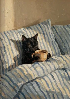
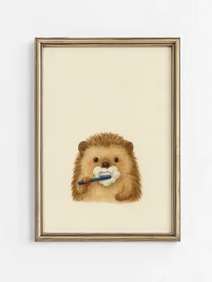
Prices are valid at publication and may change. Please refer to the product page for the latest price.
Do not overlook the impact of lighting on your wall art. In the Philippines, natural light can be incredibly intense during the day, which can wash out delicate pastel colors or create harsh glare on glossy surfaces. Conversely, artificial lighting, such as warm-white LED bulbs, can shift how colors appear in the evening, making cool tones look slightly yellow. Observe how light moves across your target wall throughout the day before deciding on the color intensity and finish of your posters.
Matching Family Poster Styles to Your Interior Theme
Family posters generally fall into four main design categories: minimalist line art, warm illustrations, vintage sepia prints, and custom eclectic layouts. Each style has a distinct visual weight that can either act as a bold focal point or serve as a subtle, complementary accent on your wall.

Achieving a balanced look requires deciding whether you want your family posters to harmonize with your existing color palette or provide an intentional, high-contrast accent. Harmonizing creates a serene, cohesive atmosphere, while contrasting can inject energy and focus into a quiet room.
Minimalist Line Art and Typography for Modern Spaces
If your home features contemporary, Scandinavian, or minimalist design, clean and uncluttered family posters are an excellent choice. Continuous line art, which depicts family silhouettes in a single, unbroken stroke, offers a sophisticated and modern way to represent your loved ones. Simple typographic prints featuring family names, coordinates of a meaningful place, or inspiring quotes also fit seamlessly into these streamlined environments.
To maintain this sleek aesthetic, opt for posters printed on high-quality matte paper. Matte finishes prevent distracting reflections from nearby windows or overhead lights. Frame these prints using thin, frameless clips or slim metal and light wood frames in black, white, or natural oak. These minimalist borders protect the artwork without drawing attention away from the clean lines of the design itself.
However, keep in mind the physical limitations of minimalist art. A single, highly detailed minimalist poster can sometimes look sparse or lost on a large, empty wall. If you have a spacious room with high ceilings, consider grouping multiple minimalist prints together in a structured gallery wall or choosing a larger format to ensure the artwork holds its own against the scale of the room.
Illustrated and Watercolor Designs for Warm or Bohemian Homes
For homes that embrace a cozy, bohemian, or rustic aesthetic, expressive and colorful family illustrations bring a wonderful sense of warmth. Custom watercolor portraits, whimsical digital illustrations, or family prints set against lush botanical backgrounds pair beautifully with natural materials. If your living room features rattan chairs, woven baskets, potted palms, and earthy textiles like linen or cotton, an illustrated poster will feel right at home.
To enhance the organic, tactile feel of a bohemian space, consider printing your family illustrations on textured fine art paper or canvas. These materials have a visible grain that adds depth to watercolor washes and digital brushstrokes, making the artwork feel more like an original painting than a flat print.
Before finalizing your order, always request a digital color proof from the illustrator or print shop. Warm indoor lighting, which is common in cozy Filipino living rooms, can intensify yellow and orange hues. Checking the proof ensures that the vibrant colors in the illustration will complement, rather than clash with, your existing lighting fixtures and warm wood tones.
Vintage and Sepia Tones for Traditional or Industrial Rooms
Traditional and industrial interiors benefit greatly from the nostalgic charm of vintage-style family prints. If your home features classic elements like dark wood furniture, leather sofas, or exposed brick walls, sepia-toned photographs or retro-themed typography will integrate seamlessly. These styles evoke a sense of heritage and timelessness, making your family history feel like an integral part of the home’s architecture.
The choice of frame is crucial for reinforcing this aesthetic. Ornate wooden frames with gold accents or distressed metal borders work wonderfully to anchor vintage prints. These heavier, more decorative frames match the substantial feel of traditional furniture and the raw, textured look of industrial decor.
When displaying vintage prints, avoid high-gloss finishes. Glossy paper reflects light easily, which can break the authentic vintage illusion under bright overhead lights or near large windows. A satin or luster finish provides a gentle sheen that preserves the depth of dark sepia tones without the distracting glare of high-gloss coatings.
Personalized and Custom Layouts for Eclectic or Transitional Decor
Eclectic and transitional homes, which blend elements from different eras and styles, are highly suitable backdrops for customized family posters. Custom photo collages, personalized family crests, or mixed-media layouts allow you to incorporate various colors and textures from your room’s diverse palette. This flexibility makes custom layouts an excellent tool for tying together mismatched furniture or decor pieces.
To keep an eclectic display from feeling chaotic, use a unifying element, such as a consistent frame color. Framing a diverse collection of family photos, illustrations, and typography in matching classic black or white frames anchors the pieces, turning a potentially messy wall into a curated gallery.
When ordering custom layouts, always verify the image resolution requirements. Large-format prints require high-resolution files to prevent pixelation and blurriness. If you are compiling older family photos or digital snapshots, check that the file sizes meet the printer’s specifications before committing to a large print size.
Sizing, Framing, and Gallery Wall Placement Strategies
Selecting the right style is only half the battle; how you size, frame, and arrange your family posters determines their ultimate visual impact. A common mistake is hanging a poster that is too small for the wall, which can make the space feel unfinished. As a general guideline, wall art should occupy roughly two-thirds to three-quarters of the width of the furniture it hangs above, such as a sofa, console table, or bed.
Framing materials require careful consideration, especially in the tropical climate of the Philippines. High humidity can trap moisture inside a frame, leading to mold growth or paper warping over time. While glass offers classic clarity, acrylic glazing is a lightweight, shatter-resistant alternative that is highly suitable for larger frames. If you choose glass, ensure the frame backing is sealed well to resist moisture. Opt for acid-free mat boards to prevent the poster paper from yellowing or deteriorating where it touches the frame.
When planning a gallery wall, you can choose between a structured grid layout or a more relaxed, salon-style arrangement. Grid layouts work well for minimalist and modern spaces, requiring precise measurements and identical frames. Salon-style layouts are ideal for eclectic or bohemian rooms, allowing you to mix different frame sizes and styles. Keep a consistent spacing of 5 to 8 centimeters between frames to maintain a cohesive look.
For safety, especially when working at heights or mounting heavy, glass-fronted frames on concrete walls, use appropriate wall anchors and heavy-duty hanging hardware. If you are unsure about drilling into masonry or securing a heavy frame safely, it is wise to consult a professional installer to prevent damage to your walls or artwork.
What to Verify Before Ordering Custom or Printed Posters
To ensure your family posters look as beautiful on your wall as they do on your screen, run through a quick pre-purchase checklist. First, verify the print resolution. For a crisp, professional finish, images should be at least 300 DPI (dots per inch) at the final print size. Low-resolution files will result in soft edges and visible pixels, which can ruin the look of custom designs.
Next, check the specifications of the materials used by the printing service. Look for heavy paper weights, typically 200 gsm (grams per square meter) or higher, which resist warping in humid conditions. Archival pigment inks are highly recommended, as they offer excellent fade resistance compared to standard dye-based inks, ensuring your family memories remain vibrant for years. Ask the seller if they use moisture-resistant packaging, such as heavy-duty cardboard tubes or flat mailers with plastic sleeves, to protect the prints during transit in humid weather.
Finally, review the seller’s proofing and return policies. Because custom and personalized items cannot easily be resold, many shops do not offer returns unless there is a manufacturing defect. Requesting a digital proof before printing allows you to catch any spelling errors, layout issues, or color discrepancies. Additionally, check the estimated shipping times, especially if you are ordering for a special occasion or holiday, to ensure your posters arrive when expected.
Frequently Asked Questions (FAQ)
How do I protect family posters from humidity and fading?
To protect your family posters from the tropical humidity and intense sunlight of the Philippines, use UV-protective glass or acrylic glazing in your frames. This helps block harmful ultraviolet rays that cause colors to fade over time. Avoid hanging your posters in high-moisture areas, such as directly opposite open bathroom doors or near kitchen cooking zones. Ensure your rooms are well-ventilated, and consider using a dehumidifier or running air conditioning periodically to keep indoor humidity levels stable, which prevents the paper from warping or developing mold.
Can I mix different family poster styles in one room?
Yes, you can successfully mix different family poster styles in one room by using a unifying element to tie them together. For instance, you can combine a minimalist line art print with a vintage sepia photograph if you use identical frame styles and colors. Another effective strategy is to maintain a consistent color palette across different art styles. To keep the room visually balanced, place bolder, highly detailed illustrated pieces on one wall and balance them with simpler, typography-based prints on the opposite or adjacent walls.

Community discussion
Share your experience or ask a question. Comments are reviewed before publication.