
Styling a bold red Christmas theme during the festive Ber months brings an undeniable warmth and energy to the home. However, because red is an incredibly high-saturation color, it can quickly dominate a room, making the space feel smaller, warmer, and visually chaotic if not handled with care. The key to a successful red holiday design lies in restraint, strategic placement, and the deliberate use of contrasting textures and neutral anchors. By treating red as a curated design choice rather than a default color for every ornament, you can create a sophisticated, festive environment that feels balanced and inviting throughout the holiday season.
Establish Your Red Decor Baseline and Focal Points
To prevent your home from feeling like an overwhelming sea of crimson, start by identifying one or two primary focal areas to anchor your theme. The main Christmas tree and the living room mantel or entryway console are excellent candidates for these high-impact zones. Concentrating your boldest red elements in these specific areas gives the eye a clear place to land, establishing a sense of visual order.
Next, determine your dominant shade of red. Whether you prefer a deep, dramatic burgundy, a classic cherry red, or a rustic brick red, keeping this primary shade consistent across your major decor pieces prevents visual confusion. Mixing too many competing undertones in equal amounts can make the design feel disjointed rather than intentional.
Products mentioned in this guide
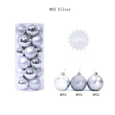
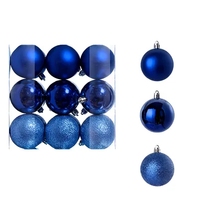
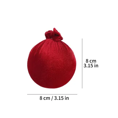


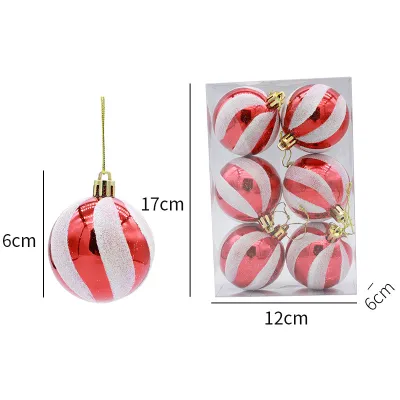
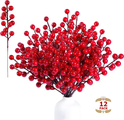
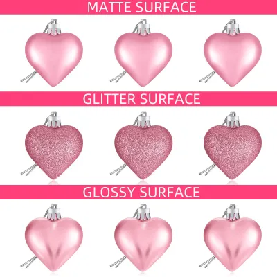
Prices are valid at publication and may change. Please refer to the product page for the latest price.
Finally, assess your existing room colors and ambient lighting. If your walls are painted in cool grays or bright whites, red elements will appear exceptionally vibrant. Take note of how natural light enters the room during the day and how your existing light fixtures distribute light in the evening, as this will influence how intense your red decor appears against your everyday interior backdrop.
Balance Bold Red with Neutral and Metallic Anchors
A successful red theme relies heavily on the supporting colors that surround it. To soften the visual heat of intense red, pair it with natural neutrals that ground the space. In tropical climates, incorporating light wood tones, fresh green foliage, and crisp white or cream textiles helps cool down the room’s aesthetic. Woven abaca, rattan, and light oak elements provide an organic contrast that makes the red feel intentional rather than overbearing.

Introduce metallic accents like brushed gold, champagne brass, or antique silver sparingly. These reflective surfaces break up solid blocks of red and bounce light around the room, adding a touch of elegance without competing for attention. A few well-placed metallic candle holders or metallic threads in your table runner can elevate the entire setup.
Avoid introducing other highly saturated primary colors, such as bright royal blues or intense purples, which can clash with your red theme. Keeping the supporting palette neutral ensures that the red remains the star of the show without causing visual fatigue or making the room feel cluttered.
Layer Textures and Patterns for Visual Depth
When working with a single dominant color, relying on a single texture can make your decor look flat and uninspiring. To create a rich, inviting atmosphere, layer a variety of textures throughout your setup. Combine plush velvet ribbons, matte-finished ceramic ornaments, glossy glass baubles, and rustic woven baskets. The way light interacts with these different surfaces creates natural highlights and shadows, giving your red elements visual depth.
You can also incorporate subtle patterns where red serves as a secondary or accent color. A delicate cream-and-red plaid throw blanket, a striped stocking, or botanical prints featuring red berries can introduce the color in a softer, more diluted way. This approach allows you to extend the theme throughout the room without adding solid, heavy blocks of color.
Additionally, pay close attention to how your lighting temperature affects these materials. Warm white lighting (ideally between 2700K and 3000K) enhances the natural warmth of red fabrics and surfaces, making the space feel cozy. Cool white lighting, on the other hand, can make red tones look harsh or slightly purplish, so verify the color temperature of your LED string lights before hanging them.
Apply the Rule of Proportion in Red Christmas Styling
Achieving visual balance requires careful attention to the scale and distribution of your decorations. Scale your large red statement pieces, such as wreaths or oversized bows, in proportion to your room’s wall height, ceiling clearance, and furniture sizes. A massive red wreath on a small apartment wall can feel claustrophobic, while tiny red ornaments on a grand, high-ceilinged tree will look lost.
For smaller red accents, distribute them in odd numbers—such as clusters of three or five ornaments on a tray—to create natural, eye-catching vignettes. Spacing these clusters out across the room prevents any single area from feeling neglected while ensuring the color is carried cohesive throughout the space.
Most importantly, leave adequate negative space around your red decor clusters. Allowing empty areas on shelves, tables, and walls gives the eyes a place to rest. This breathing room is essential for keeping a bold red theme from feeling cluttered, allowing each carefully selected piece to be appreciated individually.
Adapt Red Decor for Different Rooms and Lighting Conditions
Not every room in your home should feature the same intensity of red. In smaller or poorly lit spaces, such as narrow hallways, powder rooms, or compact bedrooms, tone down the red elements significantly to avoid making the rooms feel cramped or closed-in. A single red candle or a small sprig of red berries in a clear vase is often enough to carry the festive spirit into these areas.
In high-traffic or multi-purpose areas like the kitchen or home office, use red strictly as an accent color. This keeps the environment calm and functional, preventing the high-energy color from becoming a distraction during daily tasks.
It is also crucial to observe how your decor transitions from day to night. Bright tropical sunlight can make red decorations look incredibly vibrant and warm during the day, while artificial evening lights will soften and deepen the tones. When selecting light fixtures or string lights to illuminate your red decor, always verify the voltage compatibility (typically 220V in local outlets) and check for proper electrical safety certifications, such as the Import Commodity Clearance (ICC) or Philippine Standard (PS) marks, to ensure safe operation throughout the long holiday season.
Evaluate and Refine Your Red Christmas Setup
Once you have placed your decorations, take a step back and evaluate the room as a whole. Walk to the main entry point of the space and look around to check the visual weight distribution. If your eyes are immediately pulled to one heavy corner while the rest of the room feels empty, relocate a few red items to achieve a more balanced flow.
Safety should always remain a top priority during this final refinement phase. If you are installing red lighting strings, hanging heavy garlands at height, or setting up outdoor displays in damp areas, ensure you isolate the power source before beginning. Always follow the manufacturer’s installation instructions, verify the weight limits of your mounting hooks, and consult a qualified professional for any fixed electrical wiring modifications. Keep all extension cords neatly organized and away from walkways to maintain clear, safe pathways for your family and guests.
Frequently Asked Questions (FAQ)
Can I mix different shades of red in my Christmas decor?
Yes, you can successfully mix different shades of red, but it requires a systematic approach to avoid visual discord. Group similar undertones together; for instance, pair cool berry tones like raspberry and burgundy, or keep warm orange-reds like tomato and terracotta in their own groupings. To maintain harmony, establish one dominant shade of red to make up about 70% of your red decor, and use the other shades as subtle accents. This variation adds sophisticated depth to your holiday display without making the space feel chaotic.
How do I incorporate a traditional parol into a modern red theme?
Integrating a traditional star lantern, or parol, into a modern red theme is a beautiful way to honor local heritage while maintaining a clean aesthetic. To do this seamlessly, match the parol’s lighting color temperature with the other light sources in your room. If your tree and accent lights use warm white LEDs, choose a parol that emits a matching warm glow rather than a cool white or multicolored flash. Position the parol as the primary focal point of a window or central wall, and keep the surrounding red decor minimal. This intentional negative space allows the intricate craftsmanship of the parol to stand out beautifully without competing with other decorations. Always ensure the lantern is securely mounted using hooks rated for its weight, and verify that its electrical plug and voltage are compatible with your outlets.
Community discussion
Share your experience or ask a question. Comments are reviewed before publication.