
Styling unique decorative pieces like Chinese lantern pineapple wall art requires a thoughtful balance of cultural narrative, spatial scale, and color harmony. Whether you are aiming to revitalize a spacious living room or establish a serene sanctuary in your bedroom, integrating this distinctive fusion motif relies on grounding its vivid imagery within your existing layout. By choosing the right framing, aligning the artwork with key furniture anchors, and echoing its warm tones through local textures, you can seamlessly blend this eye-catching art style into your home.
Introducing a piece of chinese lantern pineaple wall art brings an immediate sense of warmth and character to a room. Achieving a cohesive look is not about matching every element perfectly, but rather about creating a dialogue between the artwork and the surrounding space.
Decoding the Tropical-Asian Fusion Aesthetic
The striking visual combination of Chinese lanterns and pineapples blends two rich cultural symbols into a single, cohesive aesthetic. In traditional iconography, the pineapple stands as a symbol of hospitality, warmth, and prosperity, making it a welcoming addition to any communal space. Meanwhile, Chinese lanterns evoke heritage, celebration, and traditional Asian design. Together, they form a tropical-Asian fusion that feels both celebratory and deeply rooted in history.
Products mentioned in this guide
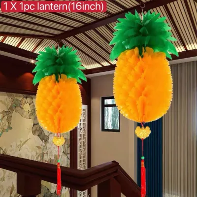
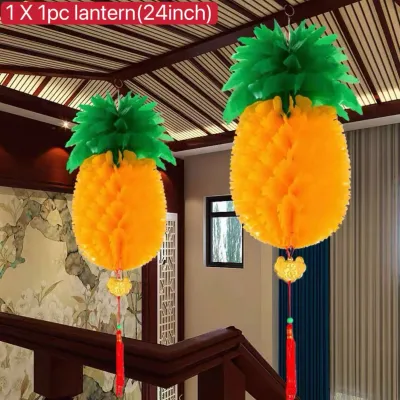
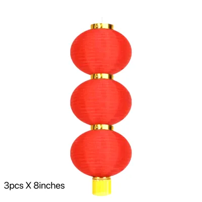
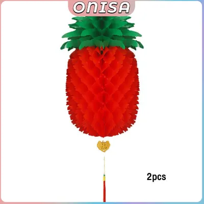
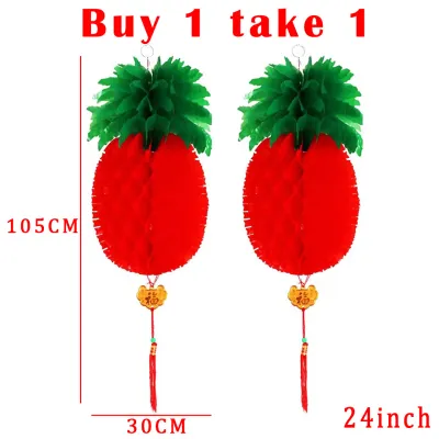
Prices are valid at publication and may change. Please refer to the product page for the latest price.
This particular artistic style fits naturally into the architectural and interior design landscapes of the Philippines. From classic colonial-inspired spaces reminiscent of historic homes to contemporary tropical modern residences, this art style bridges the gap between natural warmth and structured heritage. The organic textures of the pineapple complement the geometric, flowing lines of the lanterns, offering a versatile visual anchor that thrives in warm, sunlit interiors.
Before mounting your artwork, take a moment to analyze your room’s current design profile. If your space leans toward mid-century modern, the clean lines of your furniture will provide an excellent contrast to the intricate details of the print. For homes embracing a traditional or rustic tropical style, the art will enhance the existing warmth of wooden furniture and woven accents. Identifying these relationships early helps you decide whether the art should act as a contrasting statement or a harmonious extension of your current theme.
Living Room Layouts: Creating a Social Focal Point
The living room serves as the social heart of the home, making it the ideal venue for a bold visual statement. Because this area hosts both lively conversations and quiet family gatherings, your wall art should act as a primary visual anchor that draws the eye without overwhelming the room’s conversational flow. Achieving this balance depends heavily on where and how you position the piece relative to your main seating arrangements.

Whether you choose to display a singular, commanding canvas or integrate the motif into a larger collection, the placement must feel intentional and structurally supported. A floating piece of art with no connection to the furniture below can make a room feel disjointed. By grounding the artwork with your sofa or surrounding decor, you establish a sense of permanence and architectural intent.
Above the Sofa Placement
Hanging your artwork directly above the sofa is a classic design choice that instantly establishes a central focal point. To ensure this arrangement looks balanced, you must pay close attention to proportional scaling. As a general rule of thumb, your artwork—or the combined span of a multi-piece set—should cover approximately two-thirds to three-quarters of the total width of the sofa. An undersized frame will look lost on a vast wall, while an oversized piece can make your seating area feel cramped and top-heavy.
The visual weight of the Chinese lantern and pineapple motifs is naturally substantial due to their intricate patterns and warm color palettes. To ground this strong visual presence, ensure that the sofa beneath it possesses enough physical or visual weight to support the composition. A plush, deep-seated couch or a sofa with clean, structured lines works beautifully to anchor the vibrant energy of the artwork above.
Equally important is the vertical clearance between the furniture and the frame. Aim to leave a comfortable breathing room of about six to eight inches (approximately 15 to 20 centimeters) between the top of the sofa back and the bottom of the picture frame. This gap is wide enough to prevent the art from feeling crowded by cushions, yet tight enough to maintain a cohesive visual connection between the seating and the wall decor.
Gallery Wall Integration
If a single large print feels too dominant for your living room, integrating your chinese lantern pineaple art into a curated gallery wall is a highly effective alternative. This approach allows you to soften the bold cultural motif by surrounding it with complementary visual elements. Consider pairing the primary print with subtle botanical sketches, clean geometric patterns, or muted abstract textures that echo the organic and cultural themes of the main piece.
To keep a diverse collection of prints from looking chaotic, rely on consistent framing and matting. Using identical frame colors—such as matte black, warm oak, or natural pine—across all pieces creates an instant visual thread that ties the gallery together. Alternatively, you can use uniform off-white mat boards to establish a clean, museum-like boundary around each individual artwork, allowing different styles to coexist peacefully.
Before driving any nails or mounting strips into your wall, always test your layout on the floor first. Lay out all your framed pieces on a flat surface and experiment with different spacings and positions until you find a balanced arrangement. Take a digital photograph of the finalized floor layout to serve as your guide when transitioning the pieces to the wall, ensuring your spacing remains consistent and visually pleasing.
Bedroom Arrangements: Cultivating a Restful Vibe
In the bedroom, the primary design goal shifts from social engagement to personal rest and rejuvenation. Because the Chinese lantern and pineapple motifs carry vibrant cultural energy and warm color tones, adapting them for a sleeping space requires a gentler, more deliberate approach. The goal is to celebrate the beauty of the artwork without overstimulating your senses when it is time to wind down.
By focusing on symmetry, softer color variations, and intimate scaling, you can successfully introduce these rich designs into your bedroom. Positioned correctly, the art can enhance the room’s cozy, cocoon-like atmosphere while maintaining a clean, uncluttered aesthetic that promotes restful sleep.
Above the Bed Symmetry
Placing art directly above the headboard is an excellent way to create a serene, balanced focal point that greets you every time you enter the room. To foster a sense of calmness, opt for a single, oversized canvas or a perfectly symmetrical diptych (a two-panel set). Symmetrical arrangements are naturally pleasing to the human eye and bring an immediate sense of order and stability to a sleeping environment.
When selecting your specific print, consider color tuning to match the bedroom’s restful purpose. Depending on your conditional preferences, you might look for variations of the lantern and pineapple theme that feature muted, softer, or cooler tones—such as sage greens, soft terracotta, dusty blues, or warm creams—rather than high-energy, saturated oranges and reds. These gentler hues respect the room’s relaxing function while still showcasing the intricate beauty of the design.
For a polished installation, always align the artwork precisely with the centerline of your bed and headboard. Ensure the outer edges of the frame do not extend beyond the width of the headboard, as this can create an unbalanced, top-heavy look. Leave a safe clearance of six to ten inches above the headboard to prevent any accidental contact when sitting up or adjusting pillows.
Bedside Accent Pairing
An elegant alternative to hanging art above the headboard is utilizing the wall space directly above your nightstands. Hanging matching or thematically linked smaller framed prints on either side of the bed offers a sophisticated, balanced look that frames the bed beautifully. This layout works exceptionally well in rooms with low ceilings or those where a large headboard leaves little vertical wall space above it.
When styling bedside art, keep the scale intimate and the hanging height low. The center of the artwork should align closely with eye level when you are sitting up in bed, creating a personal, close-up viewing experience. This lower placement helps ground the bedside area, making it feel cozy and self-contained.
To prevent this setup from feeling cluttered, pair the bedside prints with minimalist nightstands and clean-lined accessories. If you use bedside tables, ensure they remain organized and free of excessive decorative objects. This restraint allows the paired artwork to shine as the primary decorative element on either side of your bed, maintaining a clean and peaceful environment.
Unifying the Space: Frames, Mats, and Color Echoing
Achieving a truly cohesive interior design goes beyond simple placement; it requires physically presenting the artwork in a way that harmonizes with your room’s materials and color palette. The right combination of frame materials, matting techniques, and decorative accents will bridge the gap between your wall art and the rest of your living space.
- Frame Materials: To enhance the tropical-Asian fusion theme, select frame materials that reflect the natural textures of the region. Natural light woods, such as ash or oak, bring a clean, modern warmth that complements tropical modern interiors. For a more traditional or colonial vibe, rich dark woods or frames made from woven rattan or wicker add beautiful tactile depth. If your room features contemporary elements, a slim matte black metal frame offers a sharp, sophisticated border that makes the colors of the art pop without competing with the design. Expect custom framing in local workshops to range from budget-friendly options to premium packages (typically ₱1,500 to ₱5,000+ depending on the size and glass type).
- Matting Techniques: Never underestimate the power of a good mat board. Utilizing wide, neutral mats in shades of off-white, cream, or soft gray gives the intricate lantern and pineapple motifs essential breathing room. A generous mat—typically two to three inches wide—elevates the print, giving it a professional, gallery-quality appearance. It also prevents the artwork from feeling compressed by the frame, allowing the eye to focus on the fine details of the print.
- Color Echoing: To tie the room together in a seamless visual loop, pull secondary or accent colors directly from the wall art and distribute them throughout the space. If the print features soft terracotta, sage green, or warm gold, introduce these exact shades in your throw pillows, area rugs, window curtains, or small ceramic objects. For instance, pairing the art with a handwoven abaca rug or linen cushions in matching earth tones creates a grounded, natural connection. This subtle repetition of color guides the eye naturally through the room, making the artwork feel like an organic part of the overall design rather than an afterthought.
Highlighting the Art: Lighting and Shelf Styling
Proper lighting and thoughtful surrounding decor are the final steps in showcasing your wall art to its fullest potential. By illuminating the piece correctly and styling the surrounding surfaces, you can draw attention to the artwork safely and elegantly.
- Lighting Placement: To bring out the rich textures and colors of your print, consider installing dedicated picture lights, adjustable track lighting, or directional wall sconces. Position the light source to wash over the canvas or framed print evenly, taking care to adjust the angle to avoid harsh glare on glass surfaces or glossy finishes. For a warm, inviting atmosphere, you may opt for warm-white light sources (around 2700K to 3000K), which beautifully complement the golden and earthy tones of the lantern and pineapple motifs.
- Safety Boundary: When planning your lighting setup, safety must remain your top priority. Before installing any fixed wiring, hardwired picture lights, or new electrical wall fixtures, always turn off the power at the main circuit breaker (power-isolation). Ensure you carefully review the manufacturer's installation instructions, verify the voltage compatibility (such as the standard 220V system in the Philippines), base/interface types, and wattage limits of your fixtures. If the installation requires modifying your home's electrical wiring, working at heights, or mounting heavy suspended loads, you must hire a qualified professional electrician to complete the work safely and in compliance with local safety standards.
- Shelf Styling: If you have a console table, sideboard, or floating shelf positioned below your artwork, use this surface to display subtle, complementary accents. To avoid a kitschy or overly literal presentation, steer clear of repeating the exact pineapple or lantern shapes in your physical decor. Instead, opt for abstract nods to the theme, such as a simple, elegant glass vase holding tropical monstera leaves, or a single textured ceramic vessel. This approach supports the artwork's narrative without cluttering the visual field.
Frequently Asked Questions (FAQ)
Can I hang canvas wall art in humid areas of the house?
In tropical climates, high humidity levels can significantly affect canvas tension and cause wooden stretcher bars to warp or mold over time. To preserve your investment, avoid hanging canvas wall art in high-moisture zones such as bathrooms, uninsulated hallways, or directly opposite open-air kitchen spaces. Ensure your living room or bedroom maintains consistent airflow through ceiling fans, open windows, or air conditioning. Always check the manufacturer’s specific care labels and material specifications for humidity-resistance ratings, and consider opting for framed, sealed prints behind protective glass if you live in an exceptionally humid coastal area.
How high should I hang wall art above a sofa or bed?
The standard interior design principle is to hang wall art so its center point is roughly at average eye level—typically 57 to 60 inches (145 to 152 centimeters) from the floor. However, when hanging art directly above furniture like a sofa or a headboard, the relationship with the furniture takes priority. The bottom of the frame should sit approximately six to eight inches (15 to 20 centimeters) above the top of the sofa back or headboard. This clearance creates a cohesive visual grouping, ensuring the art and the furniture feel connected as a single design unit rather than floating separately on the wall.
Community discussion
Share your experience or ask a question. Comments are reviewed before publication.