
Visual comfort during long study or work-from-home (WFH) sessions isn’t just about getting the brightest bulb available. It relies on a careful balance of light output, color tone, and environmental contrast. In tropical climates like the Philippines, where home workspaces often contend with both intense daytime sun and dark, rainy afternoons, choosing the right LED reading light requires looking past marketing buzzwords to evaluate technical specifications. Understanding these metrics helps prevent eye strain, headaches, and fatigue during extended desk work.
Decoding Brightness and Color Temperature for Desk Work
When evaluating an LED reading light, brightness is often the first specification buyers look for, but it is frequently misunderstood. Packaging typically displays light output in lumens (lm), which measures the total amount of light emitted by the source in all directions. However, total fixture output differs from actual desk-level illumination. A high-lumen bulb in a poorly designed shade might scatter light everywhere instead of focusing it on your workspace. To ensure adequate illumination for reading printed text or typing, look for lamps that direct their output efficiently onto the desk surface.
Color temperature, measured in Kelvin (K), dictates the warmth or coolness of the light and directly influences visual comfort. Warmer tones ranging from 2700K to 3000K emit a cozy, yellowish glow. While comfortable for casual evening reading, warm light can make you feel drowsy during intense study sessions. Cooler, daylight tones ranging from 5000K to 6500K mimic natural sunlight and promote alertness, but excessively blue-toned light can cause glare and disrupt sleep patterns if used late at night. For balanced desk work, a neutral white range of approximately 4000K is often preferred, as it provides crisp contrast without being overly harsh on the eyes.
Products mentioned in this guide
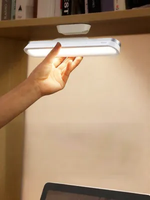
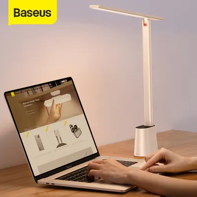
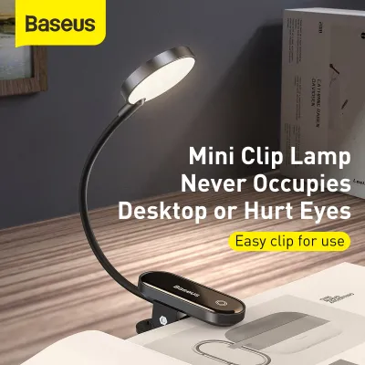
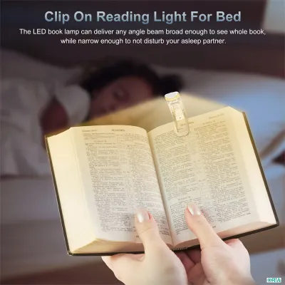
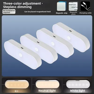
Prices are valid at publication and may change. Please refer to the product page for the latest price.
Adjusting your lamp’s brightness relative to the ambient room lighting is crucial for preventing contrast fatigue. Working in a dark room with only a single, intense spotlight on your desk forces your pupils to constantly constrict and dilate as your eyes move between the bright paper and the dark surroundings. This constant adjustment is a primary source of eye strain. To maintain a balanced environment, select a lamp with step-less dimming or multiple brightness levels, allowing you to match the lamp’s output to the changing natural light throughout the day.
Evaluating CRI for Screen and Paper Clarity
The Color Rendering Index (CRI) is a critical specification that determines how accurately a light source reveals the true colors of objects compared to natural sunlight. Rated on a scale up to 100, CRI directly affects visual clarity and contrast. For reading printed books or documents, a high CRI ensures that black ink stands out sharply against white or cream paper, reducing the subtle squinting that leads to eye fatigue. For WFH professionals dealing with color-sensitive tasks like graphic design, photo editing, or crafting, accurate color rendering is essential for quality control.

You can typically find the CRI value on the technical specification table on the back of the product packaging or within the detailed online product listing. It is often designated as “CRI” or “Ra.” A rating of 80 Ra or higher is generally recommended for standard desk tasks, while ratings of 90 Ra or above offer exceptional clarity. If a manufacturer does not list the CRI rating, the product may use lower-grade LEDs that make colors look muddy, dull, or grayish, which can increase cognitive fatigue over hours of exposure.
However, high color accuracy should not be evaluated in isolation. Even a lamp with a perfect CRI rating can cause discomfort if it lacks proper brightness control or produces harsh reflections. A successful lighting setup balances high color rendering with adjustable intensity to suit your specific task and comfort level.
Checking for Flicker, Glare, and Adjustability
Invisible high-frequency flicker in low-quality LED drivers is a hidden cause of headaches, eye strain, and general fatigue during long study sessions. Because this flicker occurs at rates faster than the human eye can consciously perceive, it often goes unnoticed until physical discomfort sets in. To verify flicker-free claims, look for technical certifications or manufacturer documentation specifying “flicker-free” or “constant current driver” technology rather than relying solely on vague marketing terms. You can also perform a quick check by viewing the illuminated lamp through your smartphone camera screen; visible moving dark bands often indicate high flicker rates.
Glare is another major contributor to eye strain. Direct glare occurs when light shines directly into your eyes, while reflective glare bounces off your computer monitor, tablet, or glossy paper. To prevent this, prioritize LED reading lights equipped with built-in diffusers, frosted covers, or recessed LED beads. These design features scatter the light rays, softening the output and minimizing harsh reflections on digital screens.
Physical adjustability is essential for directing light precisely where it is needed. A fixed lamp limits your ability to control reflections and shadows. Look for lamps featuring articulating arms, swivel heads, or flexible goosenecks. This physical flexibility allows you to position the light source below eye level and angle it away from your screen, keeping the light beam focused on your documents while keeping your eyes shielded from direct exposure.
Building Your Task Lighting Shortlist
Before purchasing an LED reading light, summarizing your core requirements into a practical decision framework ensures you select a model suited for long-term use. Use this quick checklist to compare options:
- Brightness: Multiple dimming levels or step-less adjustment to match ambient room light.
- Color Temperature: A neutral white range (around 4000K) or an adjustable Kelvin range.
- CRI: A rating of 80 Ra or higher for clear text and accurate color perception.
- Physical Adjustability: Articulating joints or a swivel head to prevent glare on screens.
In the Philippines, electrical compatibility is a vital safety consideration. Verify that the lamp’s power adapter is rated for the standard local voltage of 220V at 60Hz. Ensure the plug type matches your home outlets (typically Type A or Type B) to avoid relying on unstable, daisy-chained adapters that can pose electrical hazards. Look for recognized electrical safety marks on the product or packaging to ensure the internal wiring and power adapter meet basic safety standards.
Finally, because the actual light output, color tone, and physical footprint can feel very different in your specific room setup compared to a product photo, always check the seller’s return policy. A flexible return window allows you to test the lamp during your actual work hours and return or exchange it if it causes visual discomfort. Investing a few extra ₱ in a certified, adjustable lamp with clear technical specifications will pay off in long-term productivity and eye comfort.
Community discussion
Share your experience or ask a question. Comments are reviewed before publication.